

Instagram is doing too much
I ain’t reading all that.

Embedded is your essential guide to what’s good on the internet, written by Kate Lindsay and edited by Nick Catucci.
Looking forward to attempting to post this article on my Story and accidentally ordering Dominos. —Kate
I know I’m getting older because I’ve reached my mental threshold for new technology. The more updates my iPhone endures, the more annoyed my younger sister seems to be whenever she watches me try to use it. I have literally no idea what the AI Pin is, and absolutely no interest in finding out. I got off the train at TikTok and stayed there.
And yet even on my longtime apps I am made to feel obsolete. They continue to update and reinvent themselves in capitalism’s relentless slog. Instagram’s latest tweaks aren’t that monumental—certainly not as controversial as the ones they made in 2022—but there’s one change that’s triggering everyone over 30. What—the fuck—is this:
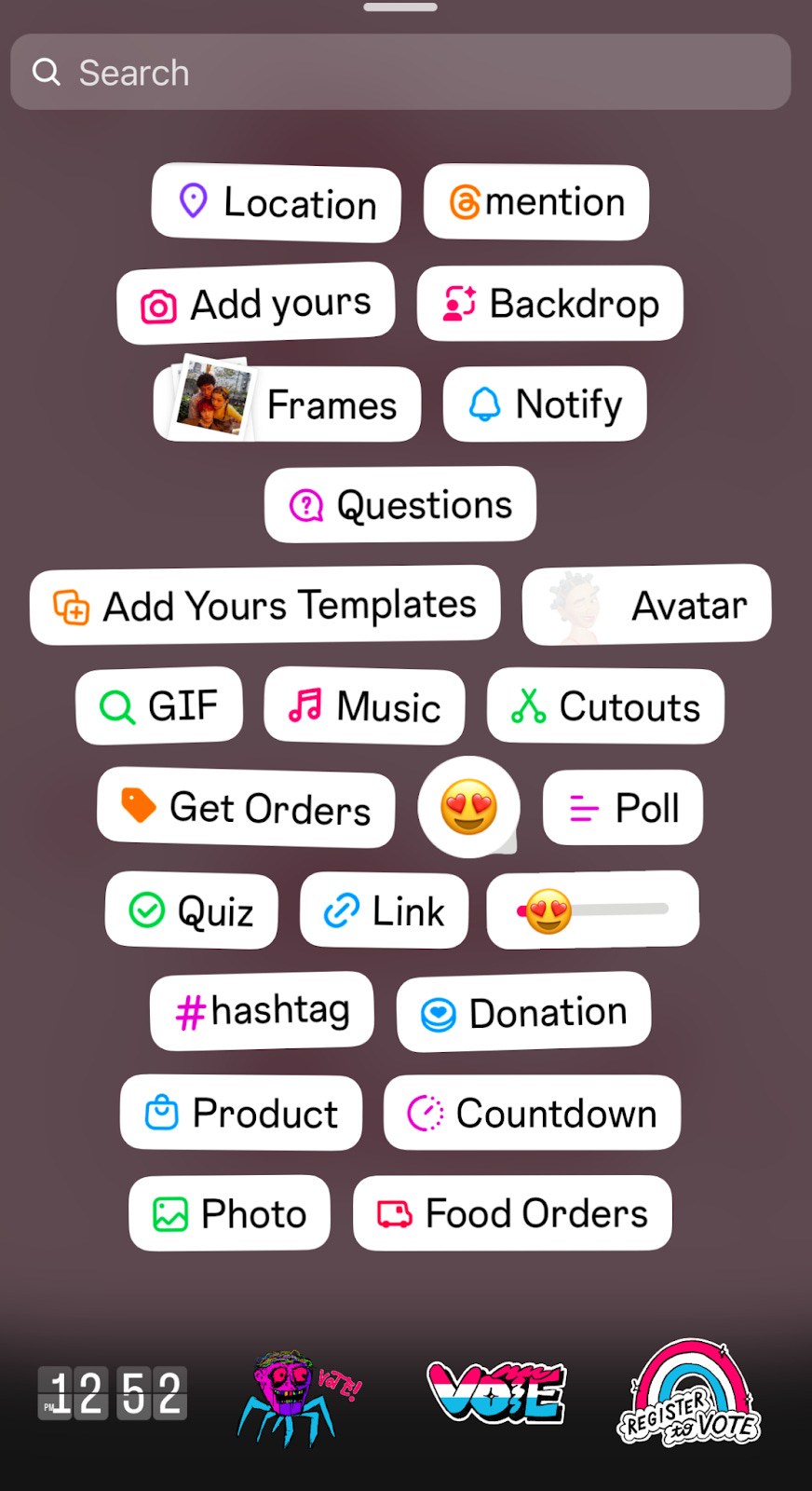
This is now what pops up when you go to add features to your Instagram Story. It's a jumble of 24 small buttons crowded impossibly close together. The text has no consistent style or capitalization. Instead of what used to be a basic drop-down list, they’ve sort of “pinned” the entirety of what Instagram offers to the top of the menu, suggesting that all these options have the same relevance to the average user. Why have they put something like “Avatar” closer to thumb than “Link”? What’s the difference between listing a “Product” and getting “Orders”? And why are “Add Yours” and “Add Yours Templates” two different buttons? Don’t tell me, those questions were rhetorical. None of these buttons have any business cluttering my screen!
As a result of this update I am now wildly disoriented every time I’ve gone to share a photo. And yes, that’s all I ever want to do: share a photo. But instead of the app learning over time and migrating my most-picked choices to the top of the list, the only icons I use are hidden inside some kind of “spot the difference” cartoon puzzle for kids. I’m forced to pinpoint the tool that will allow me to perform the task I’m most likely there to do in a sea of bizarre features like “Food Orders” that I’m being gaslit into believing are a common part of using the photo-sharing app Instagram.
Meta is a trillion-dollar company. It has over 80,000 employees that come together every day to advance the frontiers of social technology. How is this slapdash “fuck it, find it yourself” UX possibly what they landed on? On the other hand, it’s clearly a symptom of a problem Meta has always had: It’s simply doing too much. In addition to this laundry list of features, they’ve also replaced the search function with “Ask Meta AI” as if I’m going to the search bar for any other reason than to look up an account. I don’t need to know what Meta AI thinks about the various exes I stalk, nor what it will end up doing with their names if I give them to it.

Users keep telling the app over and over again what they want: To post photos for their friends. And yet for some reason Meta continually takes these learnings and decides that people avoiding Instagram’s front-facing features by increasingly using Direct Messages means they must want to *spins wheel of things Adam Mosseri scribbles into a notepad when he jolts awake at night* add faux-polaroid photo frames to their photos like Picnik.
The app itself now resembles the most annoying people who are on it, full of impossibly long profiles full of unnecessary descriptors that only manage to communicate an identity crisis. Mother. Wife. Believer. Dreamer. Chaser. Reader. Wanderer…Food Orders.
I got the IG update last week and audibly groaned when all that nonsense popped up on my screen. This post makes me feel so seen, thank you!
Had same WTF moment posting a simple pic after a 7-week absence from the app. Went away for Lenten fast and then some, returning to find the Gram resurrected as Hellboy. BTW, props for taking me back to the dog-eared doctor’s office Highlights magazines with your “spot the difference” allusion. Genius.